Key points
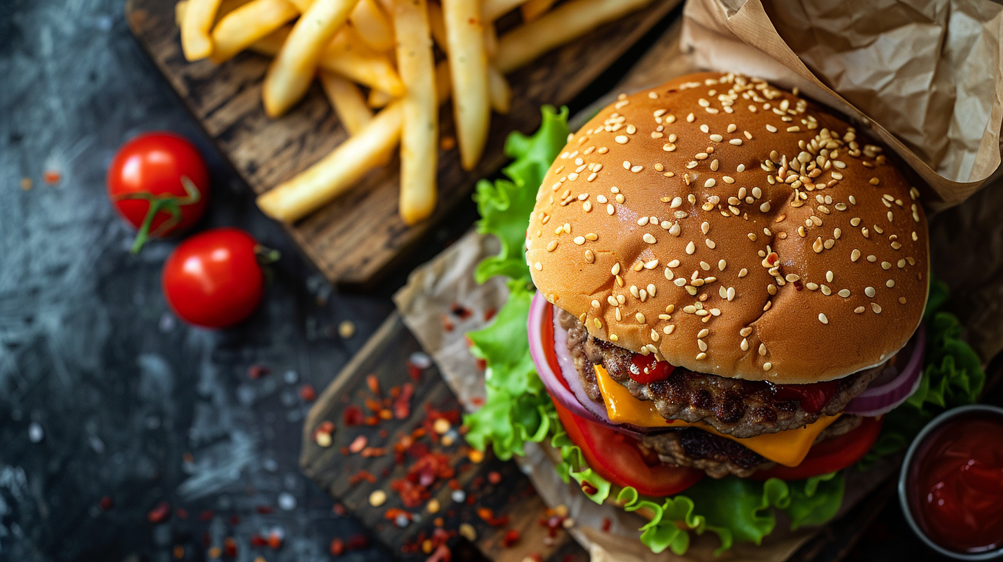
Styling and Presentation: McDonald’s makes sure their food photos look amazing. They hire pros to arrange the food perfectly, so it seems fresh and delicious. They try to make the photos match what you actually get when you order.
Lighting and Color Accuracy: Talented photographers use top-notch lighting to bring out the best in McDonald’s meals, showing off the vibrant colors and textures. They make sure the pictures make your mouth water while keeping the colors real.
Consistency and Branding: For McDonald’s, their photos need to be the same everywhere, reflecting their worldwide brand. Their photos stick to their style and help give customers the same vibe whether they see them online or in person.
Contents
- Key points
- Why Food Photos Matter in Advertising
- A Quick Look at McDonald’s Visual Ads
- Overview of McDonald’s Brand Aesthetics
- Natural vs. Artificial Lighting
- The Impact of Lighting on Fast Food Appearance
- How to Get Even Lighting Every Time
- Why Food Styling Matters for McDonald’s
- Making McDonald’s Food Look Picture-Perfect
- Must-Have Gear for a McDonald’s Photo Shoot
- How to Take Great Pictures of McDonald’s Food
- How Point of View Alters What We See
- How to Make Your Food Photos Look Great
- Editing for Brand Consistency in McDonald’s Advertising
- Ethical Considerations in Retouching Food Images
- Rise of Instagram and Influence on McDonald’s Photography
- Strategies for Creating Shareable McDonald’s Content
- Analyzing the Success of McDonald’s Social Media Campaigns
- Analysis of Successful McDonald’s Visual Advertisements
- The Evolution of McDonald’s Food Photography Over Time
- Lessons Learned from McDonald’s Advertising Strategies
Why Food Photos Matter in Advertising
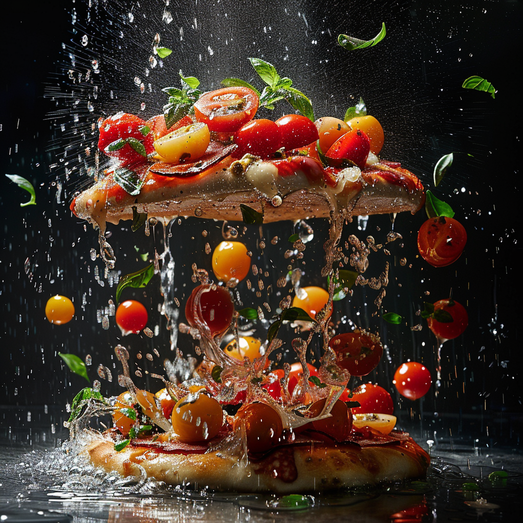
Food photos play a big role in advertising. They grab our attention quickly, which is important because we don’t have much to spare. A great picture of food can make you feel certain ways, want what’s being shown and remind you of who is selling it. For instance, a photo of a delicious McDonald’s burger makes your mouth water and reminds you that McDonald’s is the place for tasty eats.
Boosting Hunger with Pictures
How food looks often suggests how it will taste. A well-shot photo highlights a meal’s colors, textures, and seems to say it’s fresh and yummy. This look alone can make you want to eat it and plays a big part in deciding what to buy, especially online or on social media where pictures are everywhere.
Building a Brand’s Look
Food photos that always have the same style help people know a brand. When you see pictures with the same look and quality everywhere, it starts to connect with the food’s taste in your mind – good or bad. So, it’s very important to have quality photos if you want customers to come back again and again.
Growing Your Social Media Popularity
Social media loves a stunning photo. Food pics that pop get more love, shares, and chatter online. This gets the word out about a brand and sometimes even makes it go viral. As more people scan Instagram for where to eat next, posting top-notch food snaps is a no-brainer.
Showcasing Menus and Selling Online
Mouthwatering menu photos make it easier for diners to try something new. They give them an idea of what they’re going to get. On apps and websites where people choose quickly from just pictures, an awesome photo can really make one dish or restaurant stand out.
Better Deals with Appetizing Images
Ads with yummy food photos are better at getting people interested and making them act, like going to the store or buying something. Good shots tell us about the quality and value of what we’re buying, which is super important for businesses to draw in and keep customers when there’s lots of competition.
In short, food photography is key in marketing, especially for companies like McDonald’s. It shapes how people see food and can directly affect sales. Having professional photos taken isn’t just about looking good, but about making smart moves in business and marketing.
A Quick Look at McDonald’s Visual Ads
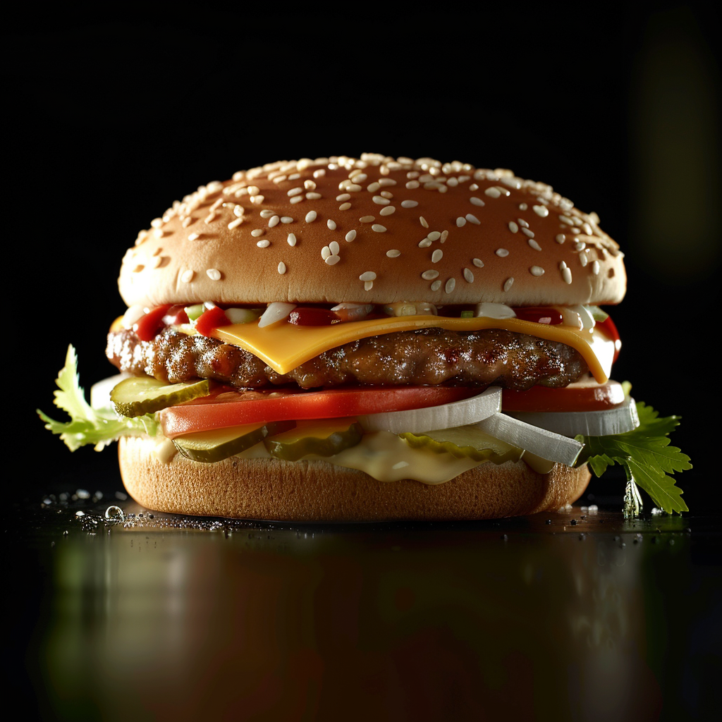
McDonald’s has always known how important good visuals are in ads. They help make a strong brand that sticks in your mind.
Starting Out and Growing. The 1950s brought us McDonald’s first steps into visual ads. Simple yet eye-catching, these ads showed off their famous eats and characters like Speedee, their very first mascot. These pictures helped lay the groundwork for what would become a huge name in the fast-food world.
The Famous Golden Arches. In the later part of the 60s, McDonald’s unveiled its now-iconic Golden Arches logo. It quickly became a sign that you could find a McDonald’s nearby, ready to serve up a meal.
Meet Ronald McDonald. During the 1960s, Ronald McDonald hit the scene. This clown was all about marketing to kids. He became a key part of McDonald’s image, showing up in ads and other materials aimed at families having fun together.
Keeping Up With Times. As technology advanced, McDonald’s switched up their advertising game to include the internet. Using social media, working with influencers, and putting out attractive online content is now a major part of their strategy.
Focusing on the Restaurant Experience. McDonald’s has always cared about what it’s like to eat inside their restaurants. Eye-popping images on the menu boards help draw people in and make eating there more enjoyable.
For years, amidst all kinds of changes, McDonald’s has kept up with fresh ideas for their visual ads. They’re good at making sure their ads not only show off their food in the best light but also keep up with what their customers care about and want.
Overview of McDonald’s Brand Aesthetics
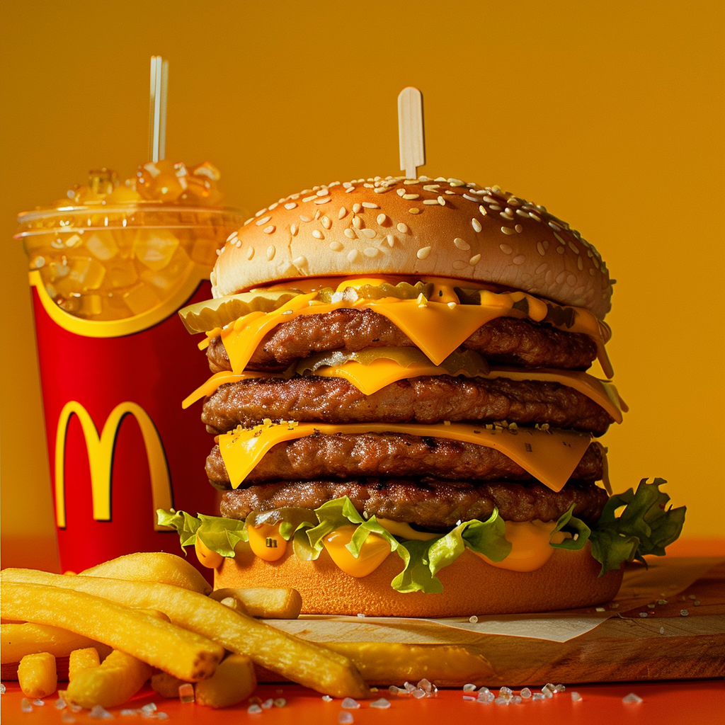
McDonald’s is known all over the world, and it has a look that people can spot right away. The famous golden arches are meant to catch your eye and make you hungry. Their food pictures are carefully made to give off a feeling of warmth that McDonald’s wants to be known for.
The bright colors in McDonald’s food pictures aren’t picked by chance. They’re meant to make the food look really tempting. The well-known red and yellow colors do more than grab your attention; they make you feel cozy and pumped up. Close-ups of hot burgers, crunchy fries, and cool drinks are shot to look like they’re leaping out at you. This is done on purpose to draw in folks who might want to eat.
It’s not just color that matters, but also how the food is arranged. Whether it’s the layers in a Big Mac or steam from hot coffee, these details add to the photos’ charm. The backgrounds and little touches in the pictures help show off McDonald’s as a friendly place. The pictures are clean and simple, so nothing takes away from the food itself.
Photos often include people eating happily. This adds life and a sense of connection to the images. Seeing images of families or friends sharing food is key to McDonald’s photo style. Each photo tells a story meant to draw people in, suggesting that McDonald’s can make any moment better.
All in all, when McDonald’s takes photos of its food, it’s about more than just showing what’s on the plate. It’s about sharing an inviting mood that you find in their restaurants. It’s no surprise that their photos work—they catch the eyes of people walking by and even those flicking through their phones, thinking about what to eat.
Putting together a good photo is key for making McDonald’s food look its best. It’s about arranging things in the shot to get people interested. The right photo can make the food seem tasty without needing words.
Understanding the Rule of Thirds in Food Composition
In photography, there’s a basic idea called the rule of thirds. For McDonald’s food pics, this means breaking down the image into nine parts with lines that space out evenly. Placing food on these lines or where they cross makes the picture balanced and grabs your interest.
Balancing Elements in McDonald’s Product Shots
To create a balanced product shot takes know-how. Every bit of McDonald’s promo pictures needs to be placed just right so it all looks good together. Maybe the Big Mac isn’t smack in the middle, or the fries guide your eye toward the burger—everything should look intentional but not forced.
The Use of Color and Texture to Create Appealing Images
Color and texture are huge in making food photos look good. McDonald’s knows this well; they use fresh greens and reds that jump out next to burgers, while shiny cheese and crisp lettuce add different feels that seem like they’ll taste great with a bite. By choosing and preparing each piece with care, photographers make even plain dishes look amazing.
Natural vs. Artificial Lighting
Lighting is key when we’re showing off food, especially from a well-known place like McDonald’s. You have to pick between natural and artificial light, and this choice really changes how the food looks in the end. Natural light is gentle and scattered, which can make McDonald’s food look fresh and tempting.
But you can’t always count on sunlight because it’s unpredictable and not always there when you need it. On the other hand, artificial light gives you more power over the situation. With gear like softboxes or LED panels, photographers are able to make sure the lighting is the same all the time, no matter the hour or the weather. This is super important to keep McDonald’s advertising looking the same no matter where you see it.
The Impact of Lighting on Fast Food Appearance
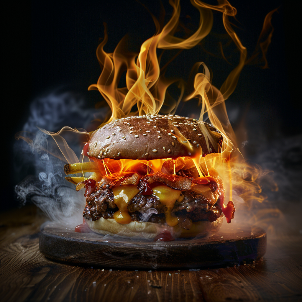
Lighting is key not only to how bright a place is but also to how tasty the food looks. Proper lighting can bring out the crispness and vibrant hues of McDonald’s meals, so the burgers seem more succulent and the fries crispy and well-cooked.
Bad lighting might throw unwelcome shadows or show off flaws, making food look dull and unattractive. It’s important to pick the correct lighting if you want to make the food look so good that people can’t wait to dig in.
How to Get Even Lighting Every Time
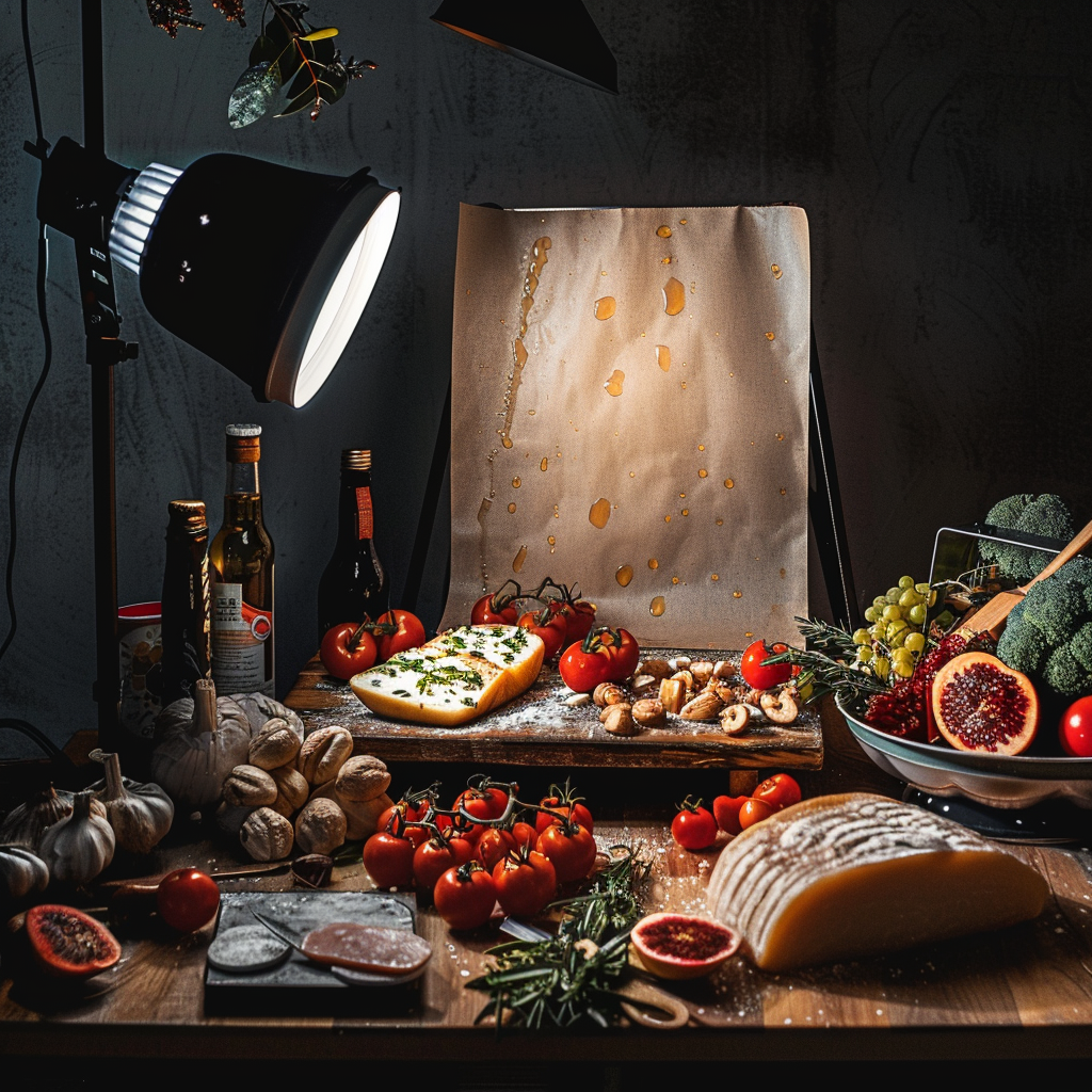
Getting the lighting right in food photos, like what you see for McDonald’s, requires close attention. Here are a few tricks to help you get that steady look:
- Try a Lightbox: It provides consistent light and keeps shadows the same.
- Stick to One White Balance Setting: This avoids odd colors that can make the food look off.
- Use Diffusers: They tone down strong lights and make the food look softer and more inviting.
- Work with Reflectors: They brighten up shadows and show off the food’s best features.
But don’t rush it – good things take time. You’ll want to try and try again, taking lots of pictures and tweaking things bit by bit.
Why Food Styling Matters for McDonald’s
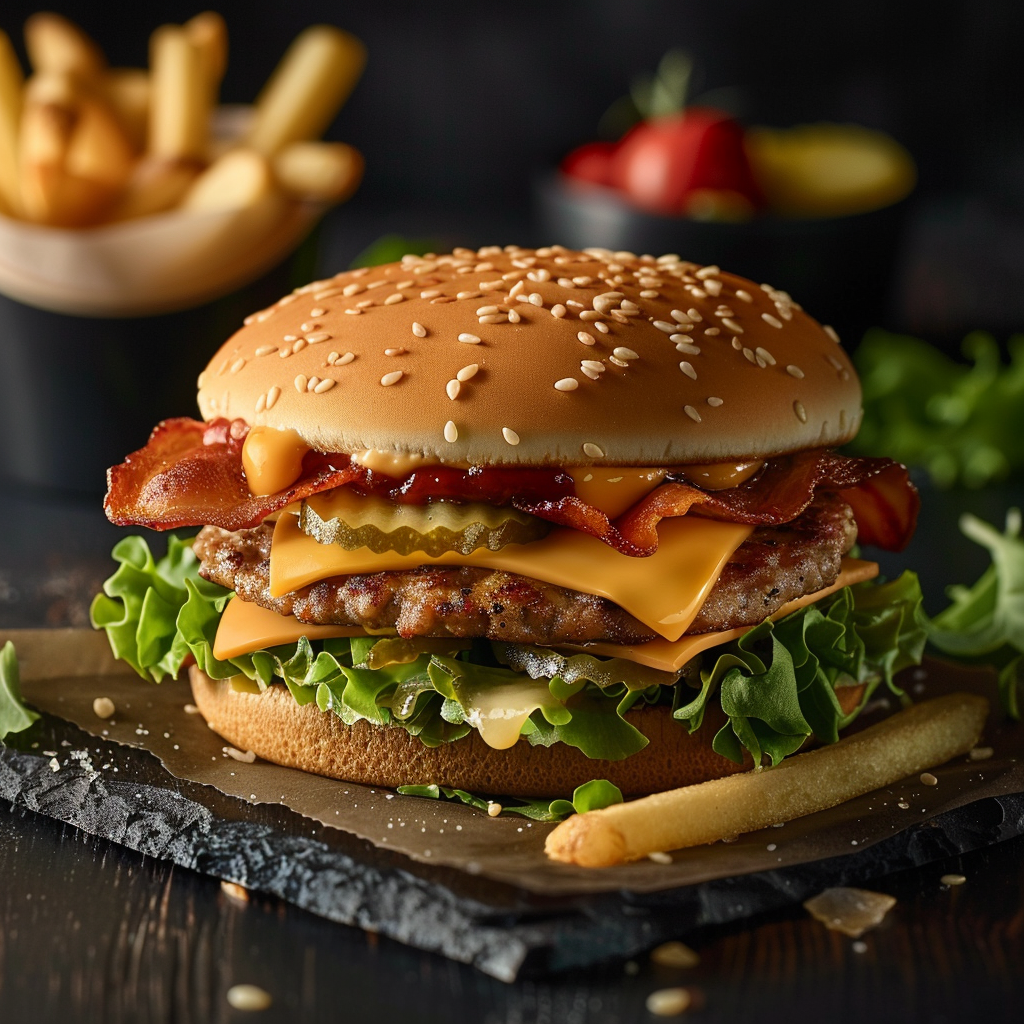
Showing off fast food in a tasty way is super important in ads. McDonald’s, which is famous for good-looking and well-known meals, really needs great food styling. It’s not just about drawing in buyers; it’s also about making sure the chow appears fresh and matches what everyone thinks they’re gonna get.
Making McDonald’s Food Look Picture-Perfect
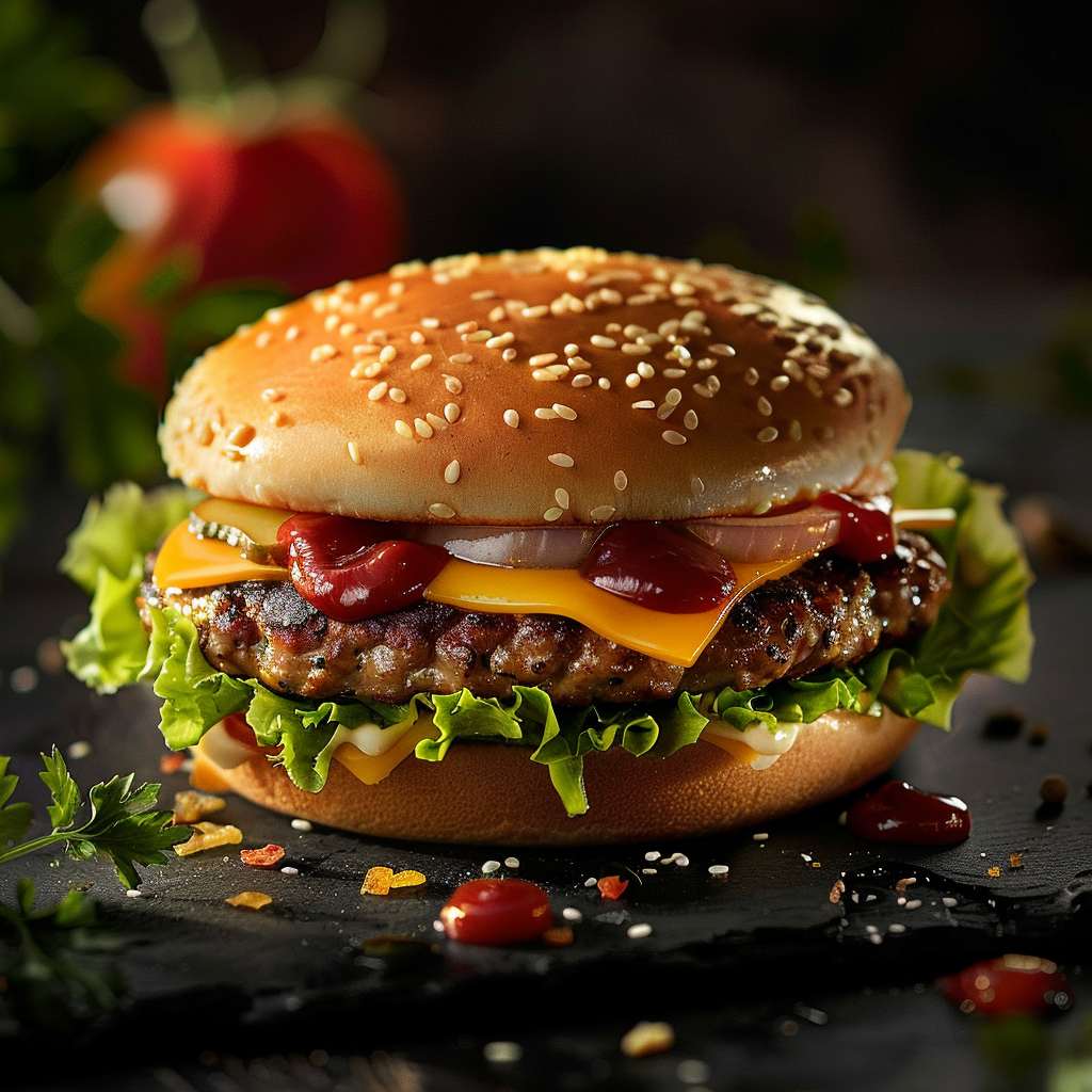
To make McDonald’s food look great in photos, there’s a detailed process involved. It begins with picking out the best-looking ingredients. When they’re put together, it’s done very carefully to show off the best features of each one.
Burgers are sometimes put together piece by piece so you can see all the layers clearly. Spraying a bit of water on vegetables can make them look dewy and fresh; similarly, condiments are often added with syringes for that perfect touch.
Must-Have Gear for a McDonald’s Photo Shoot
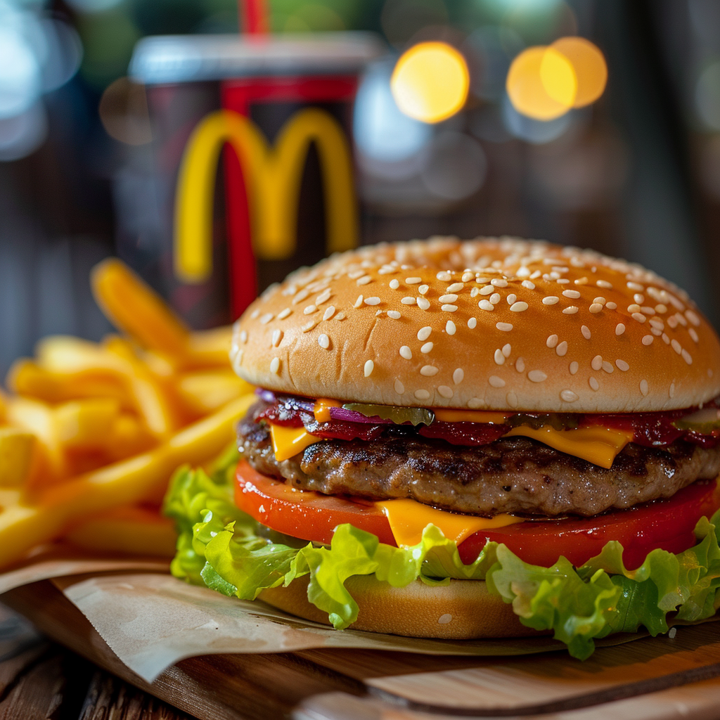
To get that perfect food shot, we use a bunch of tools. You’re likely to see:
- Tweezers, to get those toppings just right
- Brushes, to give food that juicy look with some oil or glycerin
- Blowtorches, to brown stuff on the dot
- Syringes, to add sauces without making a mess
And don’t forget the props. They gotta match McDonald’s style and make everything pop. That means picking out the right backdrops, plates, and sometimes bringing in hand models to show off the food’s size and how tasty it is.
How to Take Great Pictures of McDonald’s Food
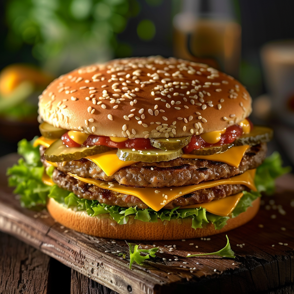
When taking pictures of McDonald’s food, it’s important to pick the best angles to make the food look tasty. A well-chosen angle highlights the texture and colors of items like the Big Mac, fries, or a McFlurry, making them look more delicious.
The Right Angles for the Job
The angle you choose changes how big or good the food looks. Top-down shots work well for meals that have lots of parts, like salads and burgers, because you can see all the layers. Side views show off tall items, such as a stacked Big Mac or tempting desserts. An angle around 45 degrees is a good middle ground that lets you see the top and side at the same time.
How Point of View Alters What We See
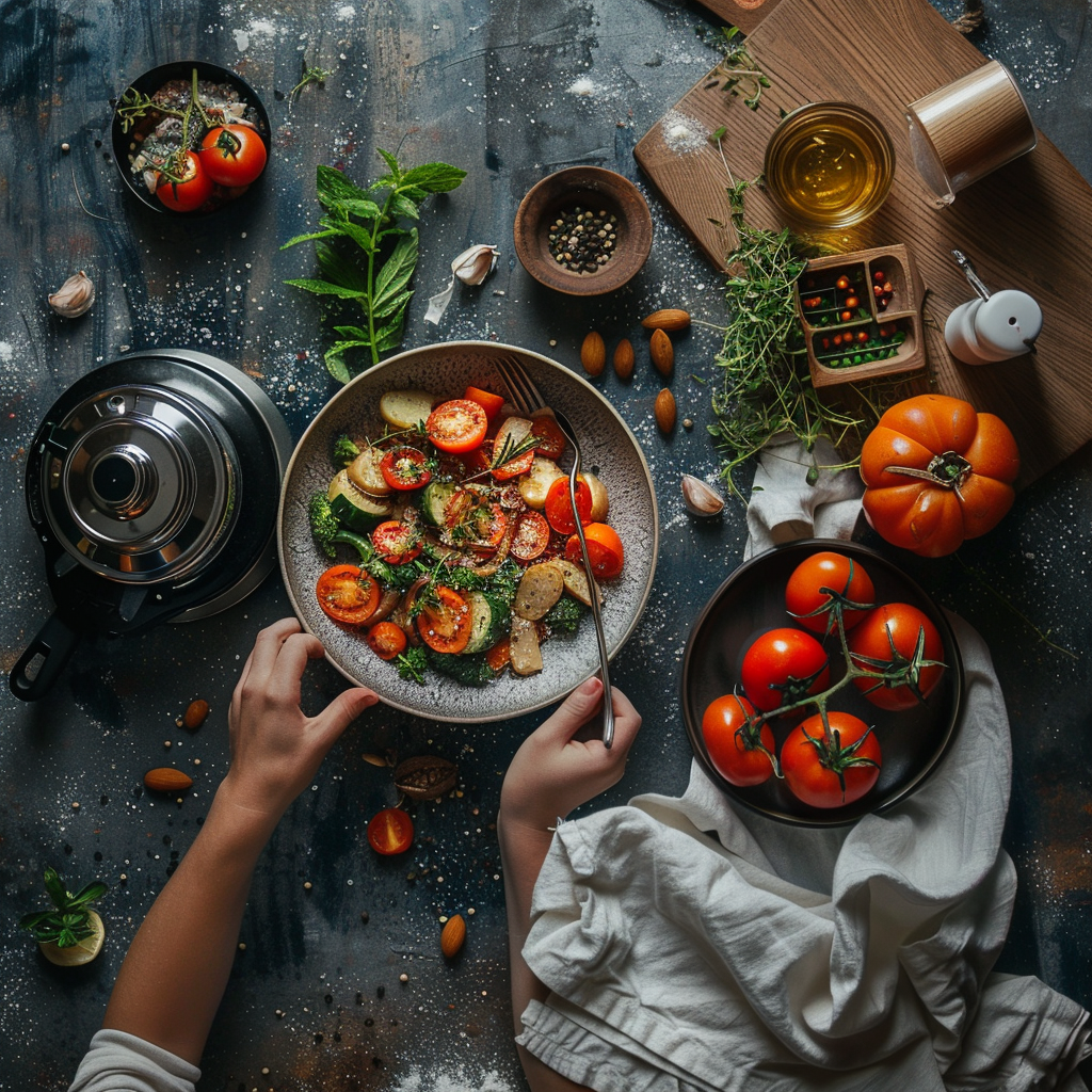
Point of view is super important in telling a good visual story, especially when it comes to taking pictures of food at McDonald’s. It affects how big and tasty the food looks to people who might want to buy it. Let’s say you get up close and personal with a burger, snapping a photo from down low. That can make the burger seem a whole lot bigger and juicier, which could make folks think it’s better quality than it actually is.
Zooming In on Food Details
When we talk about food shots, getting in close really matters. At McDonald’s, a zoomed-in photo brings out things like how crispy the lettuce is, how gooey the cheese seems, or how juicy those tomatoes are lookin’.
Close-ups are also great for showing off textures that might make your mouth water — like how crunchy McNuggets are, or that perfect swirl of soft-serve ice cream. When photographers use these up-close-and-personal techniques, it’s like they’re inviting customers to feel like they’re already munching on the food without even having a taste yet.
How to Make Your Food Photos Look Great
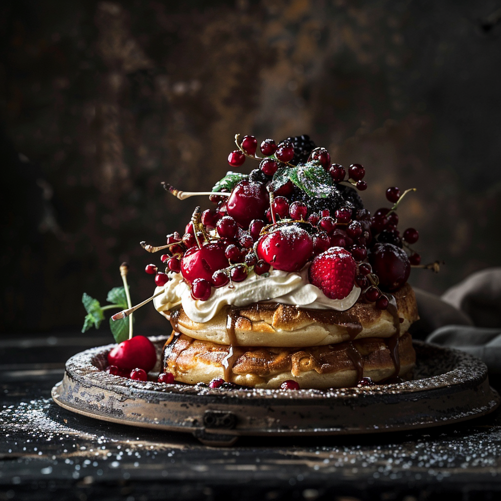
Getting that perfect shot of food, like the irresistible Big Macs, McFlurries, and fries from McDonald’s, involves more than just taking pictures. After the shoot, photographers at McDonald’s use a mixture of tricks to make the dishes look even more mouth-watering. Some common steps are:
- Color Fixes: They adjust the colors so the burger looks its best.
- Trimming and Arranging: By changing how the picture is framed, they make sure your eyes stick to the good stuff.
- Brightness and Contrast: They tweak these settings to make the items really stand out.
- Making It Crisp: This step brings out all the little details in the food’s texture.
Editing for Brand Consistency in McDonald’s Advertising
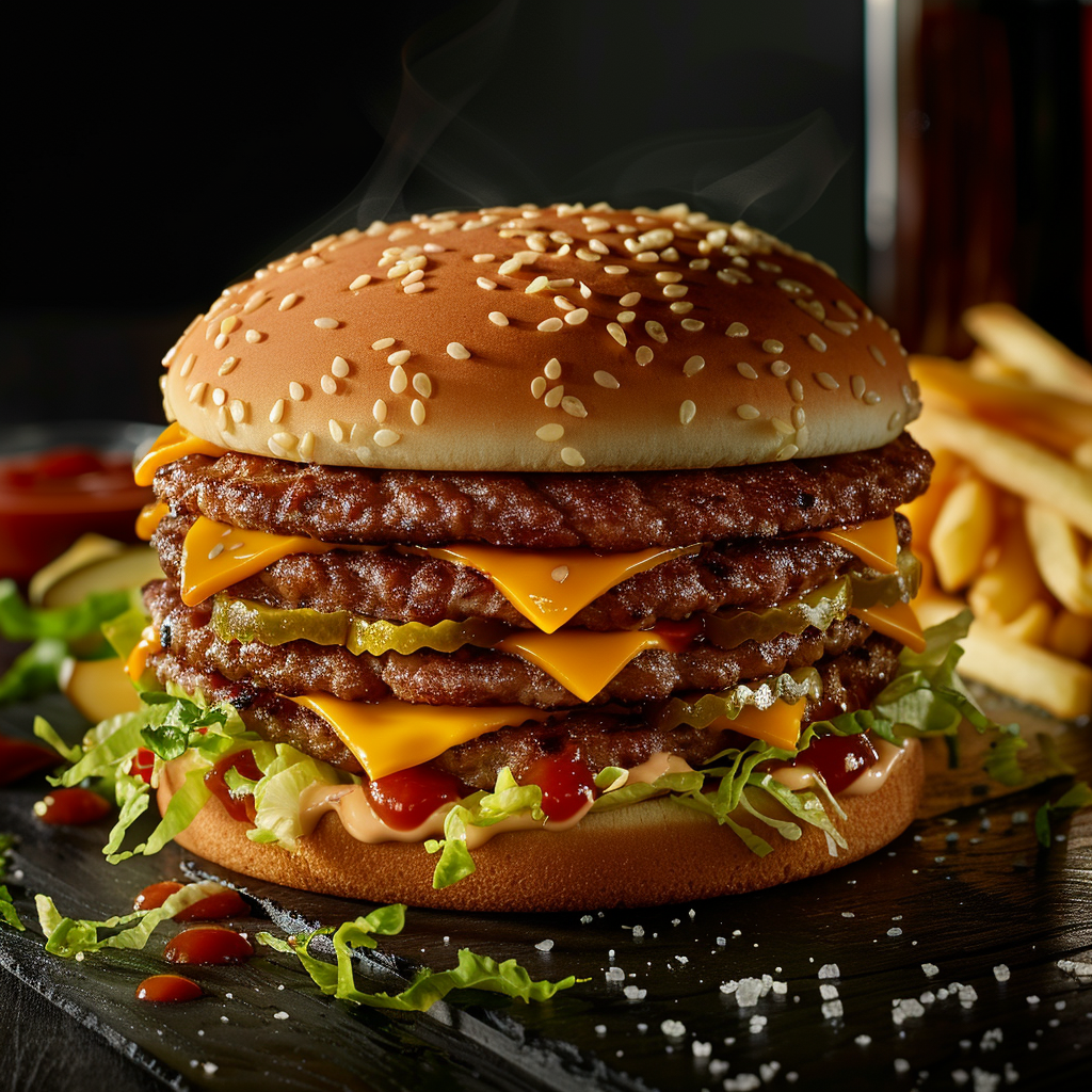
It’s crucial for McDonald’s to keep a uniform look and feel in all their ads. Editors work hard, doing things like:
- Using Presets: They use pre-set filters and settings so that the pictures look the same across the board.
- Sticking to Brand Guidelines: They’re really strict about using the right McDonald’s colors and styles.
- Quality Checks: They check every single image to make sure it’s top-notch before anyone sees it.
Ethical Considerations in Retouching Food Images
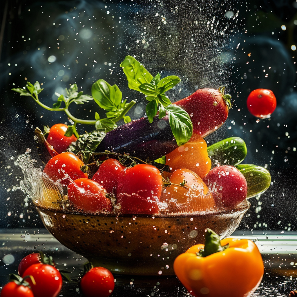
When we retouch food images, there’s always a debate about what’s too far and what starts to cheat the viewer. Most people think it’s okay to make small tweaks as long as the food still looks like itself. To keep things fair:
- Photos should show what customers will actually get.
- We shouldn’t lie about how big the portion is or how good the ingredients are.
- We need to regularly check our work and stick to the rules for ads.
Since Instagram got big, especially, it has changed how McDonald’s shows off their food big time. Because Instagram is all about pictures, brands feel they gotta make their products look extra good. What used to be fine for a menu or billboard just isn’t enough anymore. Now, every picture needs tons of attention to detail so it’ll catch someone’s eye as they scroll through their feed, and it makes a bigger splash than ever before.
Rise of Instagram and Influence on McDonald’s Photography
The way Instagram has changed how McDonald’s takes photos is super clear. The fast-food leader has really plugged into the way Instagram can grab loads of people with good-looking pics. What’s the result? Their photos now have this top-notch style that screams, ‘Look at these bright colors! Look at these fresh ingredients!’ designed to pop out from the billions of other pics out there.
If you want people to spread your content around, you’ve gotta be smart about it. For McDonald’s, it means putting out pictures that aren’t just nice to look at but also fit who they are as a brand. They’ve done this by:
– Snapping high-quality shots- Telling a good story with each image- Making sure the light and colors match up right
By doing these things, they’re hoping to leave a lasting impression that gets people talking and sharing.
Analyzing the Success of McDonald’s Social Media Campaigns
Deep diving into social media stats is crucial for understanding if McDonald’s campaigns are hitting the mark. The numbers show how well their photos do—likes, shares, comments and let them know which kinds of images click with folks. Looking at this data means McDonald’s can tweak their game plan for their next batch of photos, with goals to spread even wider and get more people interacting.
When you look back at past McDonald’s food photo strategies, you see a mix of creative skill and clever planning. Some of their campaigns are classics now, proving that looking good can make a brand shine. These examples reveal how McDonald’s shapes how they show off their menu to draw people in and stir up interest.
Analysis of Successful McDonald’s Visual Advertisements
Going back through what McDonald’s has done with ads, you noticed cool patterns of new ideas and eye-catching moves. McDonald’s tends to use lots of color, smart setups, and makes the food look so real you almost wanna bite your screen. The ads don’t just show off food; they play with your feelings, making you remember the old times or feel hungry on the spot, creating a bond with whoever sees them.
The Evolution of McDonald’s Food Photography Over Time
The way McDonald’s snaps pictures of their food has gone through some big changes. It’s all about showing what people want to see and using new tech. Back in the day, photos were simple, focusing on just the product. But as time went on, they started to feature images full of life, friends hanging out, having a blast with their burgers and fries. Today? You’re looking at crystal-clear detail and fresh angles that show off just how tempting that food is.
Lessons Learned from McDonald’s Advertising Strategies
There’s a lot to learn from how McDonald’s keeps winning with its ads. A couple of key lessons? Stay hip with cultural vibes but don’t lose what makes you ‘you.’ And yeah, making things look tasty is great but hinting at taste works wonders too. Slapping the same high quality across all types o’ media shows staying consistent with your vibe is super important.

About Author
Rachel Noël is a professional photographer and videographer from the UK with over 10+ years of experience. Rachel specializes in Underwater, Tavel & Portrait photography among other areas.
