
Key points
• Visual Impact: Adding food coloring to water in photographs makes for eye-catching images. The colors spread and twist, creating complex designs and shades. Photographers often use this method to take lively, abstract pictures that are full of energy and bright colors.
• Technical Considerations: To get good shots of food coloring in water, you need to think about the light, the precise moment of capture, and the right camera settings. Using high-speed photography gear or settings helps to stop the color movement, and proper lighting makes the colors look clear and bright.
• Artistic Expression: Putting food coloring in water lets photographers play with different color mixes and the way fluids move. This means they can make an endless variety of artistic shots. Each picture stands out based on the color choices, where the dye is added, and how the water flows.
Understanding Food Coloring and Water Photography

Taking pictures of food coloring in water is an exciting activity. It’s a fun mix of colors, light, and the movement of liquids, allowing you to snap stunning photos that catch the eye and spark imagination. Beginners can easily join in because this photograhy style doesn’t require fancy equipment or complicated techniques.
First off, picking out a good container is key. You need one that’s clear and smooth so you can see the color magic happening without any distortion. Next, fill it up with water to the right level. The choice of food coloring matters a lot too. Go for bold and bright colors for more impact. Drop them into the water slowly to see an amazing swirl of colors come to life.
Lighting’s super important as well. It shines on the display, making the colors pop against each other as they move in the water. Playing around with the light—the position and how bright it is—can change the feel and look of your picture big time. Using a fast camera helps you catch those quick moments, freezing them in time in a way that feels almost beyond real.
When doing this, remember: patience pays off. Colors will spread on their own schedule, and every photo will be one-of-a-kind with its own colorful twist. People who love this photography style enjoy never knowing exactly what they’ll get next. It lets you be as simple or as wild with your designs as you like, fitting any artistic taste.
In the end, taking photos of food coloring in water is where art meets science; it’s all about blending technical know-how with your unique creativity. Dive into this approach and you’re sure to end up with images that amaze and speak to people in a deep down sort of way.
A Bit About Food Dye and Water in Old Photos

Long ago, photographers started using food coloring in their work. This wasn’t something brand new; it happened back in the early 1900s. Back then, they wanted to make pictures full of life and feeling because color photos were still pretty basic. Some of these early camera buffs tried out various things to make black-and-white photos pop. The real change came later when digital cameras and fancy computer programs showed up.
Changing With the Times
As the years rolled by, mixing colors into pictures really took off. Better cameras and editing programs meant photos could get way more creative. Take dropping food dye into water, for example. This trick made an awesome look as the color spread through the water in cool patterns. Before, you’d have to mess around a lot in a dark room to get this effect. But nowadays, it’s a piece of cake and can jazz up anything from ads to science projects. It’s a hit because it’s always changing, never boring, and surprises us every time.
Importance of Food Coloring in Water Photos

Adding food coloring to water can really spice up photography. It lets photographers show off their work in a whole new light, with a splash of color that can make pictures pop. We’re not just talking about taking regular photos here; this is about making scenes come alive with bright, bold colors. By mixing in different colors, photographers can highlight the little details and add layers to their images, taking them from dull to dramatic. Food coloring in water is a big deal because it helps photographers express feelings, set the mood, and create an ambiance that standard photos might miss out on.
Applications in Modern Photography

Today’s photography scene highlights the vibrant use of colors. Here’s how it’s making a splash:
Creative Portraits and Fine Art
Artists bring their images to life by using colors that catch your eye and tell a story as powerful as the expressions captured in their portraits. They sometimes add food dye to water, creating either a soft, whimsical backdrop or one that’s bold and full of energy.
Advertising and Commercial Use
In advertising, it’s all about getting noticed, and bright splashes of color do the trick. Businesses are using dyes in water to make their products stand out and create memorable ads. From fizzing tablets in liquids to watches surrounded by color, these images grab and hold the viewer’s attention.
Educational Purposes and Science Visualization
This technique is also great for teaching. It shows off scientific concepts like diffusion through eye-catching demonstrations. In this way, teachers can engage students with colorful examples instead of boring text explanations.
Food coloring in water is more than just artistic—it’s used extensively in commercial photos too. At first glance, it might seem simple, but it actually needs skillful handling. Photographers with a keen palette for creativity are continuously blending new possibilities into their work.
Understanding exposure is crucial in photography. It controls if a picture is light or dark by adjusting how much light gets in. You need the right balance between shutter speed, aperture, and ISO to nail this.
Fundamentals of Exposure: Shutter Speed, Aperture, and ISO
Shutter speed is how long the shutter stays open—quick speeds freeze motion, slow ones blur movement. Aperture is about the lens opening—larger openings let in more light and blur the background. ISO sets the camera’s light sensitivity—a higher ISO works better in dim light but can make photos grainy.
You have to juggle these three elements to get the perfect exposure. Think of it like mixing ingredients in cooking to end up with the right flavor for your image.
The Role of Lighting in Capturing Vivid Images
Lighting is crucial; it brings your photos to life. When shooting dyes mixed with water, lighting brings out the intricate designs and rich colors. Sunlight often works best, but you can use lamps and reflectors for more control, casting the perfect shadows and highlights in your liquid art.
Composition Principles Relevant to Liquid Photography
Getting good shots of liquids involves sticking to certain rules that help tell your photo’s story. Here’re some tips:
- The Rule of Thirds: Place interesting parts where imaginary lines cross to make your photo more dynamic.
- Leading Lines: Let the liquid’s flow direct the viewer’s gaze around your image.
- Symmetry and Patterns: Symmetrical pictures please the eye and give a sense of balance.
- Texture: Show off patterns like ripples or waves for extra visual interest.
Dropping food coloring in water is a fun way to play with these design principles. Each photo will be unique because of way the liquids move and blend.
Color theory is key too—it’s about how we see colors based on light reflections. Different wavelengths get either absorbed or reflected and we only see the reflected ones.
Color Theory Basics
Colors follow certain rules that help photographers capture stunning pictures. They’re usually shown on a color wheel explaining how they relate to each other. Combining primary colors gives us secondary ones, showing how interconnected colors are. Knowing which colors contrast helps balance and make images pop.
Psychological Impact of Colors
Colors affect our feelings—blue can be calming or trustworthy, red can be exciting or urgent. So when choosing colors for a photo, think about what emotion you want to evoke.
How Different Colors Behave in Water
In water, colors behave differently; red disappears quickly underwater while blues tend to stick around, explaining why oceans look blue. Understanding these small changes assists photographers in creating fascinating images.
Camera Types and Best Models for High-Speed Photography
If you’re serious about capturing food coloring in water, you need a fast camera. DSLRs and mirrorless cameras are recommended because they quickly capture clear images without blur. Canon EOS 1DX Mark III and Sony A9 II are excellent choices due to their quick autofocus and shutter speeds.
Lens Selection: Macro vs. Telephoto
Picking lenses depends on the shot you want. Macros are great for close-ups of tiny details, while telephotos let you zoom in from farther away. Pick a lens with a large aperture for enough light exposure.
Tripods and Stabilization Tools for Precision Shooting
A steady tripod makes sure your photos don’t blur; pick one that’s strong and adjustable. For even more stability, try using a remote shutter release or timer to avoid shaking the camera when taking a shot.
Choosing the Right Containers for Water and Food Coloring
Picking the right container is important—you want clear glass so you can see everything happening inside. Make sure it’s big enough but not so large that it’s hard to manage with lighting.
To start taking photos with food coloring in water, prepare carefully. Pick clear glassware and keep backgrounds simple so they won’t distract from your colorful creation.
Setting Up Your Workspace

Organize a tidy space that allows you to move around freely and reach your tools and materials fast. Lighting is key, so place your lights carefully to brighten the glassware without making glare. Use a tripod for stable, sharp images. But be ready to move, and have towels handy since spills happen and cleaning them up quickly lets you concentrate on your work.
Mixing Food Coloring for Desired Effect

Explore how color theory can help you create the exact shades you need for your water-based art project. Think of yourself as a wizard mixing up magic potions. Combine the primary colors slowly and carefully to make your own unique hues. Remember, you don’t need much—a few drops will often do the job. Watch the colors as they blend together; some might zip through the water, while others will meander, forming beautiful, interesting designs.
Understanding How Water Temperature Affects Thickness

The way your colorful mixtures behave isn’t just random. The temperature of water gives it special properties. Warm water flows more easily, while cold water tends to move more slowly, becoming akin to a thick gel. You can play with this aspect more by adding thickness to the water. Thickening agents such as glycerin or corn syrup make the water thick, like syrup, which means colors move slower and more smoothly rather than spreading out quickly. By adjusting these elements, you can control the action, similar to how a director arranges a dance of colors in water.
Catching Movement with Fast Photography

Taking photos of food coloring as it blends into water is exciting but tricky because the colors move quickly. You’ll need to use a fast shutter speed to stop the motion in the photo. A smaller aperture, such as f/8 or more, will make sure your picture comes out clear. Keep an eye on ISO, too. While a high ISO helps in low light, it may make your images grainy if you go too high. Set your camera beforehand to deal with the swift color changes. Now let’s get to the specific skills and settings of your camera.
How to Shoot and Proper Camera Settings
First things first, put your camera on something solid like a tripod. This step is crucial for sharp photos. For good lighting, mix natural and artificial light to make the colors pop out more. Focus where you’ll drop the dye so your picture isn’t blurry. Remember, you might not get it right the first time, so keep trying until you do.
Manual vs. Autofocus: Choosing the Best Option
Looking at the swirling colors through your viewfinder means deciding between manual or autofocus. Manual focus gives you more control, which is better for capturing the quick-moving colors. Autofocus might work sometimes, but manual focus is the way to go for clear shots of these short-lived scenes.
Exciting Results with Burst Mode
Lastly, there’s burst mode, which is key for taking lots of pictures quickly – ideal for documenting every moment of the color show without missing anything. This method shows the whole process of how the colors mix and fold into each other. Try out burst mode and enjoy the vibrant results!
Snapping impressive shots of food dye spinning in water is about using your camera wisely. Quick shutter speeds, tight apertures, correct ISO settings, stable tripods, good lights, patience, choosing manual focus over autofocus and burst mode are what you need to capture a mesmerizing dance of blending colors.
Natural Light vs. Artificial Light Sources

Taking photos of food dye mixing with water means photographers have to choose: Use sunlight or fake lights? Sunlight gives a gentle, spread-out shine that makes the twirls of color in the water look great and not too harsh. But, you’re at the mercy of the weather and time of day, which can be a pain. On the other hand, fake lights give you a steady light whenever you need it. You get to mess with how bright they are and where they point, so you can really bring out those bold colors in the dye and make the water pop.
Controlling Reflections on Water Surface

Taking control of reflections when photographing over water is essential. Shiny water is likely to reflect things which might shift attention from what you’re trying to capture. To deal with this, photographers use tricks like changing the camera angle to avoid head-on reflections, or they put polarizing filters on their lenses to tone down the shine. They might also change how the water looks by adding glycerin, or simply take pictures from a raised position to cut down on reflection.
Creating Dramatic Backdrops with Light

Backdrops are crucial for bringing out the best in food coloring in water photos. Experimenting with light can turn a plain background into an eye-catching scene that really makes the photo pop. You can play around with lighting by shining it through different items to create cool shadows or designs, tweaking the light’s color temperature to get a cozy or chilly vibe, or using colored gels over lights for a funky look. The
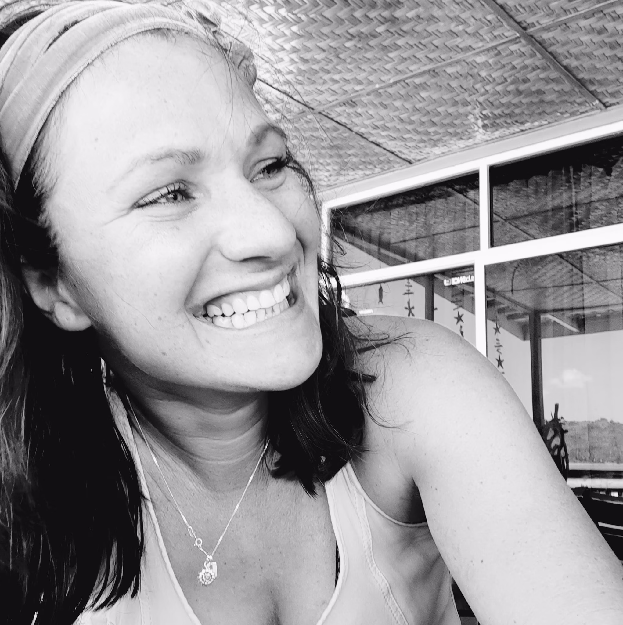
About Author
Rachel Noël is a professional photographer and videographer from the UK with over 10+ years of experience. Rachel specializes in Underwater, Tavel & Portrait photography among other areas.